For my first contest I worked on was from the site Abduzeedo's, I sadly ran out of time to finish the design for the send off date.
The contest asks to use the supplied PSD file (Photoshop file) of the company's donut and logo to finish of its design. there were very minor limitations to what the contest is asking for, just that the image is not resized and the Logo is remained as it is.

I decided to make a museum scene for this poster with having the donut being the centre object with buggler dress rats breaking in and eating the donut, the three paintings at the back of the poster are simply photos of three of my friends that I applied photoshop filters to for basic quick paintings for the museum there.
I wanted to make the poster use vibrant and dusty colours to go with the donut's "sweet" texture yet show the donut as old being in a museum case.
The site had very little restrictions on the final piece, it stated that the design's size must be left along although can be rotated which resulted in a big resolution in Photoshop. It want's the logo to be left along and just placed somewhere clear on the poster.
The hand, scissors and apple core are pieces I Had in my bedroom and then placed them into Photoshop with some filters added to them to make simple pieces of art for the museum scene, I also did this with making three " "paintings" of three of my class mates to again add to the museum theme.
2nd
For my second contest I applied to was called Amazing Astronomy 2 which asks the artist to create a digital poster of space.
I decided to use a sample of my bedroom as a template to work on:
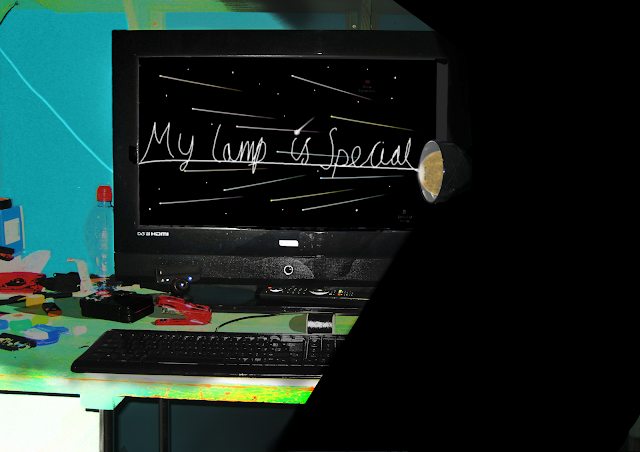
And this is what I produced with it.
I decided to make a theme with the sun and placing it inside my lamp to make it appear like my lamp is creating the light, I used a layer above where the sun is to place other a piece of transparent light grey to look like the glass of the bulb along with some white shine to give some shine. then with my TV screen I removed the white with the wand tool quite easily then created shooting stars appear like its coming out from the sun but only on the screen by using the brush tool and making translucent light grey strokes, with the colour replacement tool I gave each star a different colour with the head having a more vibrant colour.
The sun I retrieved from the NASA gallery and I fixed it in with the lamp and placed a layer of transparent white to the bulb so it appears more like it's with in a bulb.
3rd
For my 3rd Contest I applied for is from No Nukes Japan which is a site against Nuclear power in Japan.
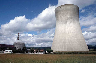
I created a poster to give suggestion for green power as opposed to Nuclear power by manipulating a power plant's top giving it a green colour and leafs, using an image of a power plant and leaf that are none copyrighted. using tools such as the polygonal lasso tool to make cracks on the power plant with vibrant coloured smoke coming out with the use of the render clouds filter, using the leaf from before I created a textured text of the leaf. the other text I made with the use of a rainbow gradient then used the brush tool with black to make a dirty foggy effect over the text.

4th
 For my 4th contest I went to the site Worth 1000 and applied to the contest Staircase to Somewhere, the objective was to take the given image of a staircase and manipulate it in any way that links to the theme of leading somewhere.
I decided to create a dark space scene with stars, a sun and glowing coloured shooting stars. I removed the area behind the pillars and used the stars effect with the noise filter I practiced in a demo. The stairs I made appear like they are floating and glowing with a bright turquoise. I made a sun by using use the circle select tool and render clouds with red and yellow.
The glowing shooting stars I made with the lasso tool with the feather pixels
For my 5th contest I went back to Worth 1000 and applied for the realist characters contest, I made a 3D image of the cartoon character Topcat, by using an old image of my cat Mayo (RIP). most of the effects here is mainly adjusting the hue colour to make it become yellow, as well as adding some drawn features like the hate and cloths.
Unfortunately because it wasn't proper 3D realism it got rejected.
The background was mostly a tracing from a screen shot from the TV series of Topcat.


1) You should have more comments of the views given by tutors and peers.
ReplyDelete2) You could expand on your findings in more details such as using different sources (ie: books, and magazines)
3) Highlight the issues related to the motivations of artists and/or the message behind his/her work.
4) Show strong evidence of references and make sure all your researches are referenced.
5) Develop more evidence of timescale and to highlight any changes made to the initial planning and explain why.