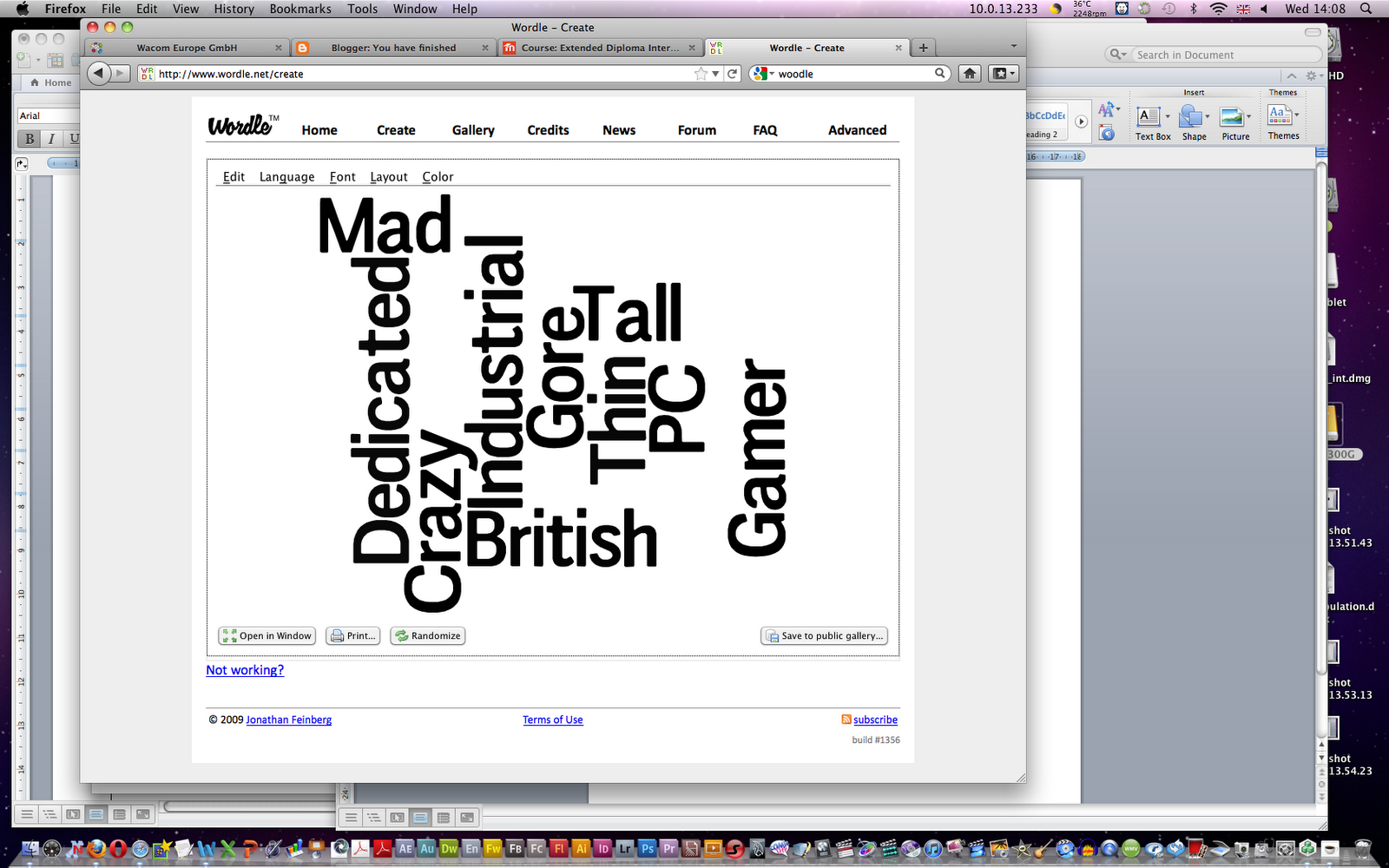
I used the Website Wordle to create basic images of words in different positions, I experimented with the different effects available to choose from to see which I liked and to use for my work, I kept the background black and the text colour white as this will be used to make it easier to use for what i shall be using the text for, I used different fonts and saved 3 different effects as PDFs.


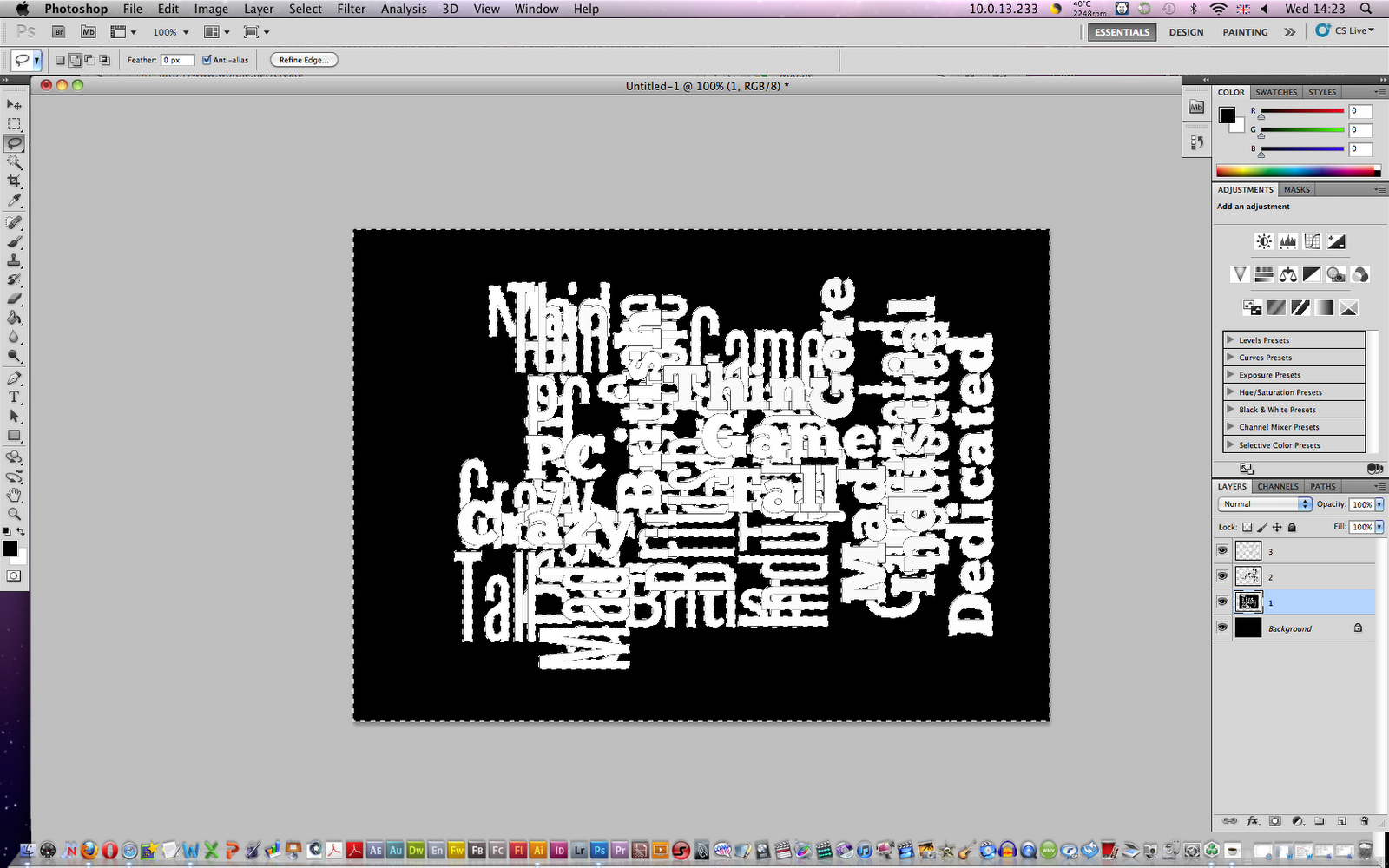
In Photoshop I made a new file with the dimensions 210 x 297 mms to create a size of A4 paper with the DPI of 72.
As the background was needed to be black I used the fill colour tool to simply turn the background layer to a full black.


I then needed to insert the three text PDFs I created with wordle into the document, I went to "file", "place" then located the PDFs to insert to the document, this is just a simple alternative method to adding files to Photoshop.


 After inserting all three PDFs I needed to remove the black background from the text on each layer, I firstly Rasterize each layer with text to make it editable. Now normally I would use a select tool like the magic wand in order to select the black area and delete, but because there is black in the letters with holes such as "a", "o" or "d"this would not be easy and take too much time as each piece of black would need to be selected.


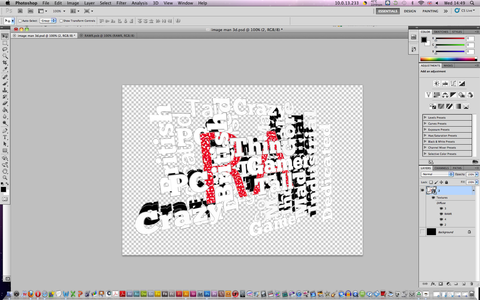
I then inserted a simple Photoshop text of the word "RA" in red, the T shaped tool in the left tool box allows me to create a box to type text into, I changed the font colour so it stands out from the other text. I then used a filter on the text I wrote under filter, pixelate and pointillize to give it an interesting effect.

I then experimented with the Photoshop 3D effects on the layers.
I select one text layer, go to the 3D Column, and select "new 3D postcard from layer", I repeat this for each text layer. After each layer has become a 3D layer I then select two layers at a time, and go the 3D column and select "Merge 3D Layer", this is repeated until ever text layer becomes a single 3D layer. I then use the 3D object rotate tool to move around the 3D image at different angles


3D text
I was taught how to make 3D text within Photoshop
I started off by making the background black, and then duplicate the background into a separate layer.
I practised using the gradient tool which is able to making a soft blend effect of two or more colours, this is simply formed by dragging a line onto the layer. I then wrote my name to use for the 3D text with the text tool.

To then give the text a 3D extrude effect, I went to the 3D column, Repoussé and Text layer, the text has now created a 3D extrude and a box has appears that gives options to change the style of the 3D effect, lowered down the "Depth" from 1 to 0.4, this makes the extrude shorter.

 With the layer that has the white to black gradient effect, I made it into a New 3D Postcard so it can be moved about in a 3D format, after this I have the text and the gradient 3D layers merged together. When I have the layer tilted down it mixes in nicely with the black background to make the image seem like there is a floor that fades into the dark.

I practised with the different 3D tools that moves around certain aspects of the 3D in different angles, the tools under object moves the whole image and mesh moves around one layer. after practising with the move tools I then went to the light bulb icon and inserted a Spot Light onto the image, this creates a light that puts a shine on the image, using the light move tool I had it position above and away from the text and being aimed at the text.
Explosion and shatter with text
In today's lessons I learned how to give text a shattered effect infront of an explosion.


I practised with the use of the crop tool to make simple cuts off from the image, this can also be used in reverse to add more of the image by adding colour from the chosen background colour.


To make the text more bold and 3D I went to layer styles and selected the Bevel and Emboss section, to make it more sharper I changed the technique drop down box from smooth to chisel hard, with the gloss contour option selected to "ring" which causes more shine to the text.
To make the shattered effect on the text I rasterized the text layer, used the polygonal lasso tool to select and move pieces of the text slightly to make the text appear split.


to make the explosion cloud behind the text I used the lasso tool on the text, as the cloud isn't to look too sharp on the edges I used the feather option which makes the edges much softer, I set the feather level to 50 pixels then used the "cloud" filter under render, I found that 50 pixels made the cloud too faint, so reattempting the process I changed the feather to 30 pixels which made the cloud more clearer.


 To make the cloud appear like its exploded from the centre I firstly made sure the text was deselected to avoid only applying to the selected pixels, with the radial blur filter used and selecting the zoom option, the cloud now appears like an explosion smog.
To give the text a pushed out explosion on the edges, I go to the text layer and right clicking on the thumbnail I select "select pixels" which does what the option says, I create a new layer, use the fill option to fill the area with 50% grey. then after deselecting the pixels repeat the use of radial blur.


 after this is done the grey text layer and the smoke layer are then merged together. with the explosion layer selected I when to the symbol (on the left of the text here) and when to hue/saturation, with the colourize box selected I was able to add colour to the smoke. This technique is useful to add rich colour to smoke like objects. Finally to give the text a sharp black outline I checked the stroke option in.
Shiny ball
I practised creating a ball with the appearance of 3D shine.
I created an orange circle using the elliptical marque tool and filling it with orange, to start off I used the dodge tool with a soft brush and made the top left of the middle lighter to appear like a light shine from an angle, with the burn tool this is repeated on the bottom right of the ball to make a shadow. To make a shadow I duplicated the layer with the orange ball, made it black, made it shorter then used the gaussian blur on the shadow.


to make the bow like image on the ball I used the elliptical marque tool to make a wide oval in the middle, then holding shift I make two taller ovals beside the first oval and this has made a unique selection, I save this selection so that I can in the future reuse it if I wanted to. I made the edge of the ball softer by making a duplicate layer of the ball filled with white, then I added a mask layer and removed most of the central white leaving the edge softer.


On the top left of the ball I added three soft white dots in a line to create the image of a spotlight pointing on it. I then added a smaller white circle in a new layer for where the number is place, then I darken the bottom right corner for a shadow appearance. Finally I text in the number 5.

Layer masking
Working in the style of Oliver Ottner I practiced adding a leaf texture to a woman's face with the use of masking in photoshop.
Starting off with an image of a woman's face and a leaf, with the woman's face opened up in Photoshop and the leaf pasted in a separate layer used the blending options to find an appropriate merge with the leaf of the woman's face, I ended up using multiply.


To use the mask I went to layer mask and reveal all to begin using the mask, with this now used the black paint brush to leave behind just the woman's skin by painting over the hair, eyes, mouth ect.
I turned down the transparency of the leave so the leave fades in nicely with the skin.
finally to give some shadow to the women's neck I made a new layer filled with 50% and made this layer transparent.

Pen tool
I practiced using the pen tool which allows me to make special shaped selections, I practiced it's use on a diamond shape which only used basic use of the pen as I only had to click on each corner, for the heart shape I had to use the pen tool to add curves and rounded sides to the heart by clicking and dragging onto the pen lines and it rounds the line to fit the heart.


Merging body parts
With an image of a Lizard and Hippo head I used Photoshop to merge the head onto the Lizard's body.


With the Hippo's head I at first free transformed the head to shrink down and rotate to fit in proportion with the Lizard, after this I used Colour balance on the Hippo's head so that it's colour matches roughly the green skin of the Lizard, doing this on the adjustment layer means I can keep the original image of the Hippo's head without any loss of data so I can change it later if needed.


With the Layer mask like used before I removed rough bits from the Hippo's head, as well as putting the original colour in it's mouth, teeth and eyes. with the stamp tool I traced and coverd up the head of the lizard by placing pixels from the background behind it. to make the Hippo head stand out better I firstly used the quick mask selection tool to select the head and the area around it on the top corner, then using the brightness and contrast layer selection to make the area darker.


I then experimented this with other animals, I fused an angry cat's head with a squirrel.

3D Stereoscopy
I practised making regular images become 3D when viewed with the red and cyan lensed glasses, I practised with the example image of a piano to make it appear to be deeper into the screen.
 The piano layer is duplicated to we have two, then using the curve adjustment I drained the red out of the first layer to create a cyan tone image, this is then repeated with the second layer but with the green and blue drained to created a red tone image. Then using the layer blending option of "screen" which blends the red and cyan to show the original image, then using the move tool I moved the red layer a little to the left so it shows red and cyan lines on the image, using the 3D glasses now makes the image appear line its inside the screen.
I then practised this technique on different images to see how good I can make it look 3D, I tried it out with one of my favourite black metal band Cradle of Filth, I made the image of the band members and their back ground appear deeper with the colour going red to the left and blue to the right, and then placed their logo in front making it appear like its popping out of the screen by reversing the colour order.

I then decided to make images appear deep in the centre but softly become looking like the edges is popping out from the screen, I tried this out with an image with stairs in an underground, then where the centre of the stairs going up I split the image of each colour into two pieces, and then I stretched out the cyan colour from the left of the image and then stretched out the red from the right of the image so that the depth goes into where the stairs lead up. It didn't work as well as I hoped from but it works just about.

With an image of the Earth I then attempted this in reverse order to make the centre appear like its popping out of the screen and with the edges going deep into the image.

Leapord Rhino
I practiced with making a Rhino have the skin of a leapord, most of the techniques here are the same used with the woman's leaf face but I also involved the use of the liquify tool to strech out the leapords skin to fit in with the Rhino. I used the patch tool to fill in the areas that require more of the leapord texture.


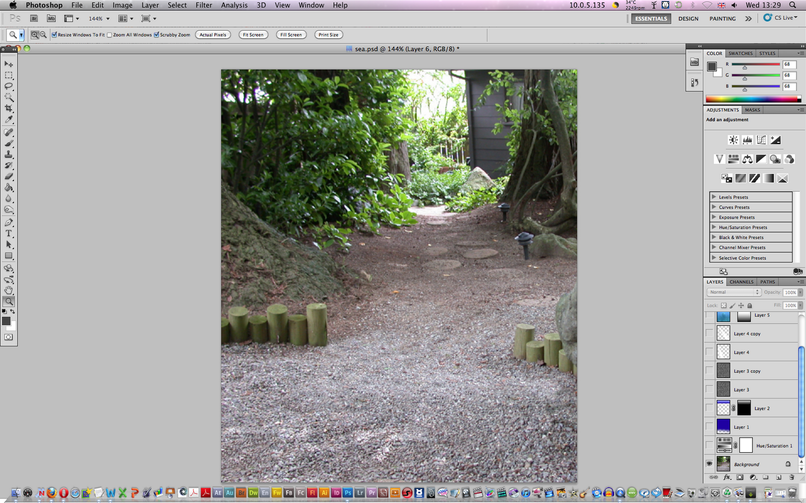
Sea Scene
Using an image of a scene with the ground covered with stones and two rows of wooden studs I created the image that it's underwater with other sea related objects.
This is the image I started off with:
I started off with adding the hue/saturation adjustment layer to make the stones appear blue. With the gradient tool I then gave the top of the scene a deep blue colour along with the bottom remain showing the stones.
In a new layer I created a new gradient with half the same deep blue and half a lighter tone of the blue and place this at the top to create a sea surface image, with this I used a distort filter called glass which creates the image of ripples, then I used the distort transform tool to stretch out the corners of the sea surface to make it appear like it reachs out into the deep.


I Added rays of light to the scene by firstly using the polygonal lasso tool to create the out lines of the rays, using the feather option set to 20 pixels the selection creates a soft edge, I filled it in with white and this has created a nice ray effect, I then used the layer option and turned down the transparency to make it transparent. I then inserted a second ray by duplicating the layer of the first one and then using the skew transformation to move the bottom of the ray to the right so it's aiming at a different direction.
I liked the use of the feather selection as I can use it to make really soft lighting effect and prehaps use it for my poster work.
I then inserted sea related objects involving a sunken plane wreckage and a shark, with the plane using a layer mask I used the gradient tool and on the mask I applied a gradient to fade out the bottom of the plane image to softly remove it from the bottom, the background of the plane adds to the sea background effect. The shark image has the shark and its original background to it, to remove the background I used a layer mask with it on hide all so at first the whole shark image is invisible, then with a white brush I carefully reveal the shark, this method of using a hide all layer mask can save time having to cover up loads of the background.


Stars
I followed steps from a youtube video made by Stodan1 on how to made a Nebular star sky effect.
The technique involves using the add noise feature on Gaussian and Mono-chromic to begin making the stars, I lowered the brightness and heightened the contrast to get a layer of bigger stars I duplicated the layer and increased the size, to avoid any noticeable pattern I rotated the stars 180 degrees.

with the eraser on a soft brush I wiped away some of the stars to decrease the heavy number of stars.

to give it a bright purple colour tone I adjusted the hue levels, then to add some different colour I added some red with the brush tool.
I like the effect created from the easy tools to make the star sky effect by using the noise.

Fruit cube


I practised making rounded objects appear cubic and flat, the process involved using an apple and placing it inside a cubic frame which acts as a guide for stretching the apple inside. I used the liquify tool to do the stretching of the image, to give the apple light reflection on the edges I used a soft white brush and made three rough lines with the corner more bolder.


I applied shadows to the apple by copy and pasting sections of the apple such as the base and then the whole of the apple for a side shadow.
With an image of a regular half sliced apple I crop it to fit with the bottom right side of the apple.

No comments:
Post a Comment